Subscription screens
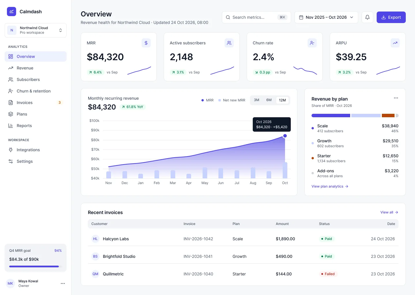
Overview, revenue, subscribers, churn & retention, invoices, plans and settings, filled with believable sample data instead of lorem ipsum.
Figma UI kit · launching mid-November
Calmdash is a Figma UI kit for subscription products. MRR, churn, cohorts and invoices, designed in light and dark, with contrast checked on every screen.
What's in v1.0
Not 500 random screens. A focused kit for the dashboards subscription businesses actually open every morning.
Overview, revenue, subscribers, churn & retention, invoices, plans and settings, filled with believable sample data instead of lorem ipsum.
MRR movements, churn trends, cohort heatmaps and plan mix, with thin lines, clear labels and colours that stay distinct in both themes.
Primitives, semantic, component. No component touches a hex value, so switching theme means switching one variable mode.
Empty, loading and error states for cards and tables, plus failed-payment rows that tell users what to do next.
One file, two themes
Same tokens, different values per theme, because contrast decides. Indigo leads in light. In dark, the accent switches to cyan, since indigo on near-black only reaches 2.9:1.
Why calm
I audit dashboards for a living. The same problems show up every time, so Calmdash fixes them before you start.
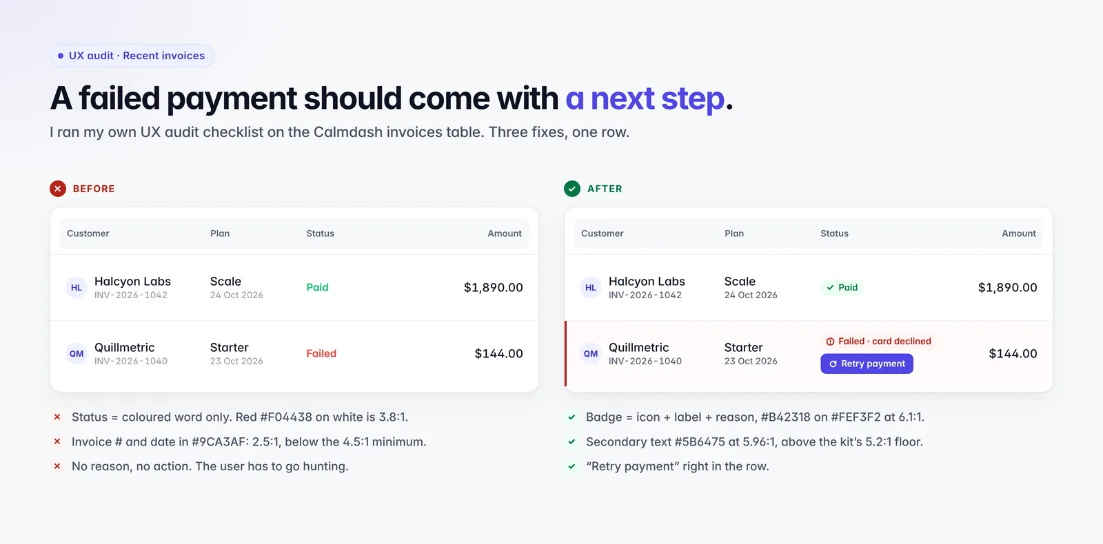
Text targets at least 5.2:1 in both themes, above the 4.5:1 WCAG 2.2 AA minimum. Every ratio is documented, not guessed.
Badges pair an icon, a label and a reason, so “Failed · card declined” reads clearly even if you can't see red.
Near-flat cards, hairline borders, tabular numbers and thin chart lines. The metrics carry the page, not the decoration.
About the maker
I design B2B products, and Calmdash is the kit I kept wishing I had on client projects: fewer screens, real subscription metrics, and accessibility checked before it ships, not after the audit. I'm building it in public, one design decision per post.
Calmdash v1.0 launches mid-November 2026. The waitlist hears first and gets early-bird pricing.